Create your survey, form or poll now
Yes, we all have seen it! Instagram has recently launched a new visual identity. They have changed their app’s interface, made it more ‘simplified’ as they describe it, or if you ask me, they made it just much ‘whiter’.
But what created most of the hype about Instagram’s new look and feel, was an entirely different, unexpected, and very poor design for Instagram’s app icon.
Of course the company celebrated the new change with a blog post, newsletter emails, a nice video, followed by a ton of articles written by third parties.
But if you do a little research and read users’ comments and reactions under the mentioned posts, you’ll notice a totally different narration than what they officially try to communicate.
Why do many dislike the new change?
Some say that people don’t like changes. They get used to things and tend to stick to the way things are. This might be the case for some of the negative reactions about Instagram’s new look and feel; but there are many design experts who have clear reasons to explain why this was a bad design decision.
Well, the original icon had a skeuomorphic style, which is generally considered to be not good when used in symbols, logos, and icons. It’s true; and these days, it’s a particularly popular design trend as well. You may have heard the general term “flat design” used to describe the relatively recent interfaces which have a very simplistic look and feel with minimal amount of details.
One of the major things that Instagram’s design team has done is converting that old skeuomorphic design of their app icon, to a very simplified and abstract glyph shape, which still can be recognized as a camera. So far so good, and honestly the glyph does have a decent graphical appearance. However, what makes it very disappointing is their choice of using that gradient fill with so many variations of colors, which are not necessarily that appealing together.
Practically, gradients are very hard to handle and reproduce, especially in printing, and in grayscale or black & white versions of logos and signs. Therefore, gradients are almost always avoided by professional logo designers. But the color combination and these practical issues are not the main problems with their choice of gradient; as Instagram lives majorly on colorful high-end screens, rather than papers and packages. Nevertheless, the main problems is that they have simply taken away the entire visual identity of the well known and recognizable brand.
It seems that their design team have been aware of the fact because this is what Instagram mentions briefly about their change in the App Store:
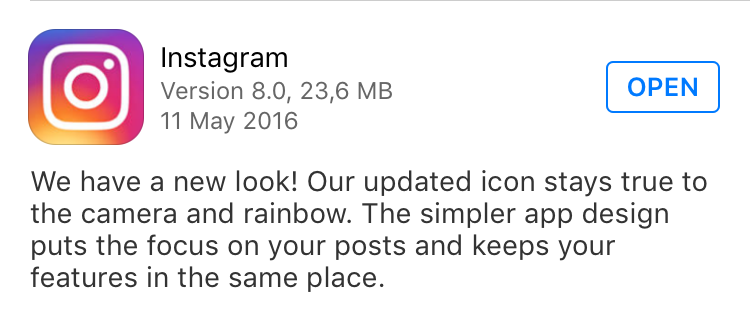
But I don’t really see their “stay true to the […] rainbow” intention, in the new app icon. Simply combining several colors together, doesn’t mean you are making a rainbow, or that you are denoting a rainbow. If the old little rainbow was a part of Instagram’s original visual identity, then this is not really staying true to that.
The problem is not just with the app icon
On top of these problems with the new logo, comes the horrible choice of changing the background color of the app’s interface to white. Well, this firstly is a primitive design mistake that simplifying an interface means removing colors and making it totally white! Naturally, to achieve a simplified, and minimalistic look and feel, one may need to remove details, textures, and colors which have no meaning or function. But in this case, the dark background color actually had a very vital function for professional users.
I bet you will not find any modern image editing programs which come with a white interface, for the same reason that you won’t find any professional photographer or graphic designer who puts up different photos or different design suggestions on a whiteboard or a white wall, to compare and decide which one looks better! If you are not a designer, you may have not used or seen Adobe® Photoshop’s user interface (which even allows you to customize what shade of gray to use as background color). But you have for sure seen how the the background color changes to black, when you tap on the screen to view your photos in fullscreen mode in Apple’s ‘Photos’ app, or when you tap on the ‘Edit’ button to work with your shots.
Using darker shades of gray as background color visually aids to amplify the colors in the picture, and see how black are the shadows and how white are the highlights. So, when a majority of your users are professional and semi-professional photographers or designers; why would you decide to make the app’s background white? When the main function of your app is watching photos and videos and all those colorful beautiful imagery, why do you downgrade the look and feel of the app? White background might be good for apps with other functions, but definitely not here!
Couldn’t Instagram ask for some feedback, before they change?
Brands, logos and products develop deep connections with users and customers. People associate with them, as they become a part of their lives and therefore as Instagram’s design team also mentions “you don’t just want to change them for the sake of novelty”. In the same article they claim that this evolution is “inspired by the community” and they did it “while staying true to Instagram’s heritage and spirit”.
So, if the company really wanted to get inspired by the community, why not just asking them for some feedback? Why not do a simple visual survey asking your own users the intention is to change so dramatically? This is especially important because a major section of your users are designers, photographers, illustrators, and visual experts.
The old app icon was truly ‘recognisable’, not necessarily because the logo was awesomely designed, but because the app was super popular and unique, with an unparalleled brand engagement.
That app icon was so iconic, that an artist like Fra Biancoshock could easily create such an amazing installation in Vilnius, Lithuania; and eveyone would immidiately recognize the icon and capture the subtle humor in the artwork.
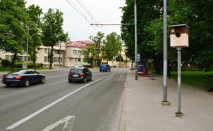
Source: brooklynstreetart.com | Photo © Fra Biancoshock
Moreover, the contemporary users and consumers want to be ‘included’ in the brands that they like and identify with. Nobody these days want to be ‘dictated to’, especially when companies have such a great impact on their everyday lives.
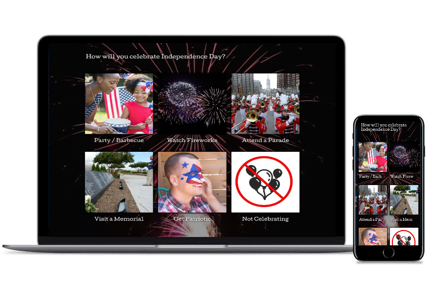
An image-based survey gives so much insight

Our mobile-ready surveys look gorgeous on any device! Scan the QRC to preview this one on your smartphone.
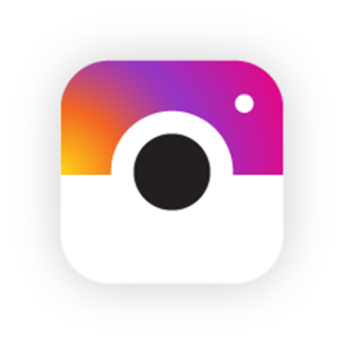
To create this survey, I’ve used a handful of creative designs published by some amazing designers on Dribbble. Either inspired by the old icon, or the new one, they have re-imagined Instagram’s app icon and created lots of great alternatives. List of their names and links to their original works are provided at the end of this article. Make sure you go there and have a look at their other awesome works!
Now, let’s imagine Instagram sends a survey like this one to you and asks you to rank your top 3 favorite app icon, because they are about to change it soon. Which ones would you choose? So please participate in this survey, vote for your top 3 favorite designs, and don’t forget to share the love with your fellas.
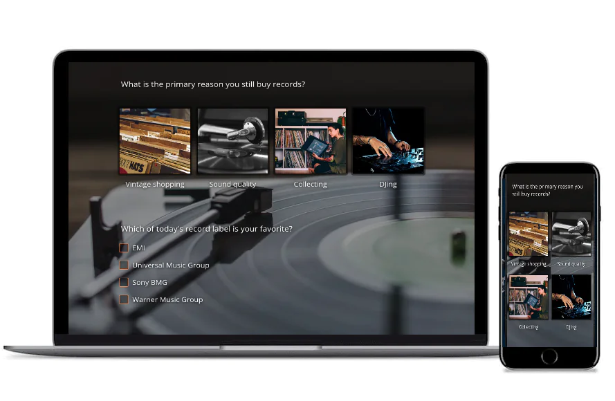
When you easily can get insights, why not sharing it with ease too?

Our mobile-ready survey analytics look gorgeous on any device! Scan the QRC to preview this one on your smartphone.
Conclusion
This article of course reflects my personal/professional opinions. But if I was the designer working on Instagram’s rebrand, I would never know how users think and what they prefer, unless I ask.
Good or bad, this design is based on an uninformed decision. Brands and companies avoid this type of outrage, simply by conducting image-based surveys.
Especial thanks and ♥s
Especial thanks to the following designers whose amazing works made creation of this imaginary survey possible!
 Abhishek Bandhu,
 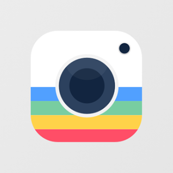 AR Ehsan,
 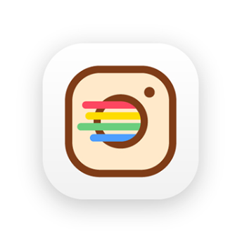 Daniel,
 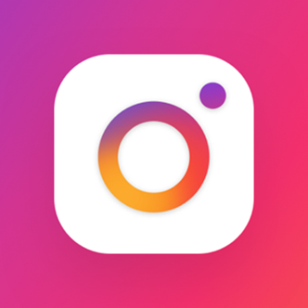 DUMMA,
 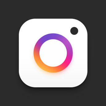 Eddie Zhou,
 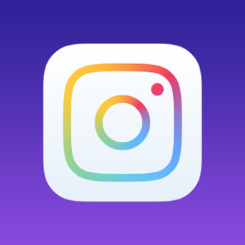 Erkan Sari,
 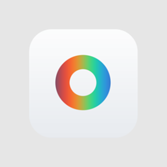 Evan Kosowski,
 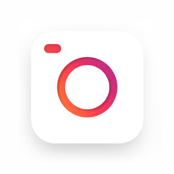 Eyyub Köksal, Francesco Scalambrino,
 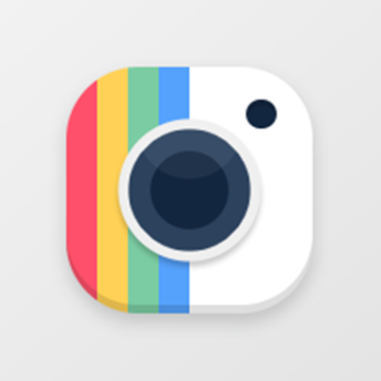 Irakli Kurtanidze,
 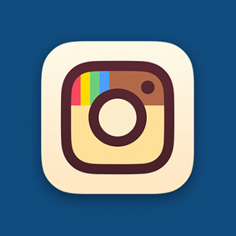 Michael Flarup,
  Minnix,
 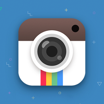 ruki,
ruki, 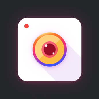 Sky,
Sky,  Sty,
Sty, 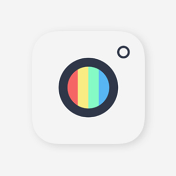 Udara Lakmal,
  yichi
yichi
Hope you liked this article,
Thanks for reading ;)